Pirate Tank Typography

GoldenMotor.com

Journeyman

New Member
Feb 22, 2010
38
0
0
49
Long Island
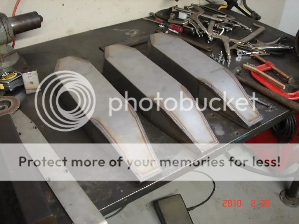
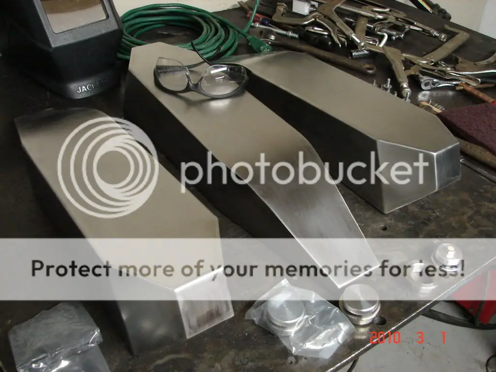
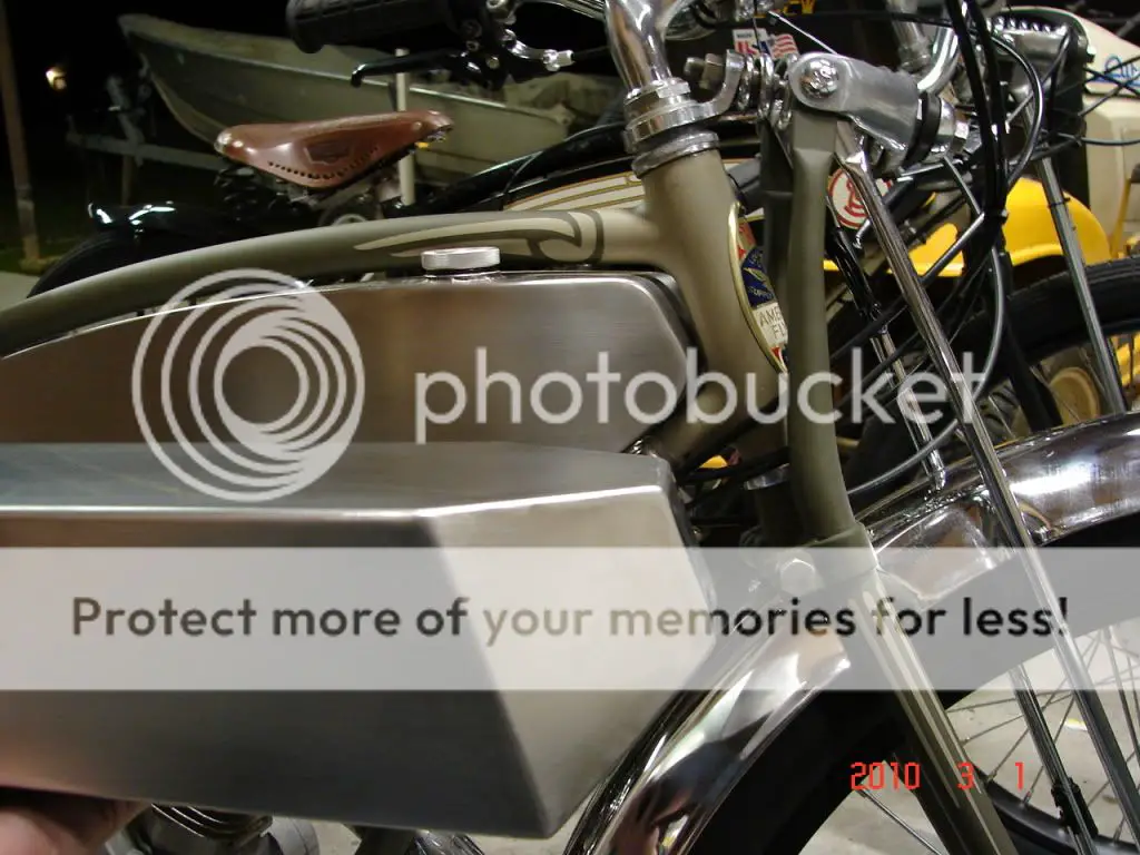
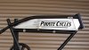
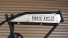
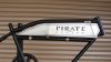
Hey everyone here is a few mock ups I came up with for the Pirate tank. I'm still working on a skull and crossbones graphic that will flow with the tank. Let me know your feedback!
 

Attachments

sportscarpat

Bonneville Bomber the Salt Flat record breaker
Jun 25, 2009
1,839
471
83
california
Hey guys, can I weigh-in here? I am impressed with all of them. Nice job Journeyman! I like #1 the best. So does this mean my little Pirate decal is out? Kidding. Number one all the way. I can get you an accurate side view when your ready. The tank is now a little longer and taller in the rear to better fit the opening. I guess I better get on my own list. I want one of these tanks, too!
Sport
 

silverbear

The Boy Who Never Grew Up
Jul 9, 2009
8,325
670
113
northeastern Minnesota
Very nice. #1 and #4 if it also had the pin striping. Must have the pin stripe. For myself I'm not much into the pirate skull & crossbones, especially the "fierce" look. Maybe if it were more like a pirate flag waving with a less detailed skull deal. I guess it makes a difference in what you want to say... watch out cause I'm a bad ass or more like, I go my own way, first class. The more detailed the skull and crossbones the more cartoon like it is. These are quality bikes with the best tanks you can find and with the best motors. Somehow you want it to say "quality". I don't think you even need the skull and crossbones... just the lettering with the board track look. Whatever you do, this whole enterprise is a winner.
SB